Is Polk Bringing Back the Heart In Their Logo?
Comments
-
I don't care for that logo either, for the same reasons.If you can't hear a difference, don't waste your money.
-
Well they managed to do just fine with these supposed unprofessional logo's. So long as they continue to put out outstanding speakers that represent a good value both with the speakers & price, they will have loyal customers like me. In the end that is the ONLY important fact that matters.Marantz AV-7705 PrePro, Classé 5 channel 200wpc Amp, Oppo 103 BluRay, Rotel RCD-1072 CDP, Sony XBR-49X800E TV, Polk S60 Main Speakers, Polk ES30 Center Channel, Polk S15 Surround Speakers SVS SB12-NSD x2
-
The Heart POLK will look good on the free bumper and window stickers sent to all forum members.:cheesygrin:>
>
>This message has been scanned by the NSA and found to be free of harmful intent.< -
Well they managed to do just fine with these supposed unprofessional logo's. So long as they continue to put out outstanding speakers that represent a good value both with the speakers & price, they will have loyal customers like me. In the end that is the ONLY important fact that matters.
That they did and I'm sure they will continue to do so. I was just stating my opinion on the logos.If you can't hear a difference, don't waste your money. -
I basically agree.Sorry, but the new logo reminds me of a 13 year old girl who dots her i's with a heart. Not very professional looking for a serious audio company, IMHO of course.Dan
My personal quest is to save to world of bad audio, one thread at a time. -
DittoThat they did and I'm sure they will continue to do so. I was just stating my opinion on the logos.Dan
My personal quest is to save to world of bad audio, one thread at a time. -
I painted over the oval logo badges on my LSi's and I removed the logo badges from my SDA's and Monitor series speakers. I peeled off the nameplate badges on the grilles of my SVS subwoofers.
Whatever a speaker company logo looks like is irrelevant to me because it will be removed or visually obscured. Proud and loyal citizen of the Digital Domain and Solid State Country!
 -
This new background is making me think of The Village People. I don't know why?I refuse to argue with idiots, because people can't tell the DIFFERENCE!
-
-
Sorry, but the new logo reminds me of a 13 year old girl who dots her i's with a heart. Not very professional looking for a serious audio company, IMHO of course.
I am having trouble imagining the new logo on the front of a pair of LSiM series speakers.Stan
Main 2ch:
Polk LSi15 (DB840 upgrade), Parasound: P/LD-1100, HCA-1000A; Denon: DVD-2910, DRM-800A; Benchmark DAC1, Monster HTS3600-MKII, Grado SR-225i; Technics SL-J2, Parasound PPH-100.
HT:
Marantz SR7010, Polk: RTA11TL (RDO198-1, XO and Damping Upgrades), S4, CS250, PSW110 , Marantz UD5005, Pioneer PL-530, Panasonic TC-P42S60
Other stuff:
Denon: DRA-835R, AVR-888, DCD-660, DRM-700A, DRR-780; Polk: S8, Monitor 5A, 5B, TSi100, RM7, PSW10 (DXi104 upgrade); Pioneer: CT-6R; Onkyo CP-1046F; Ortofon OM5E, Marantz: PM5004, CD5004, CDR-615; Parasound C/PT-600, HCA-800ii, Sony CDP-650ESD, Technics SA 5070, B&W DM601 -
I could picture the heart logo on a pair of Barbie speakers."He who fights with monsters should look to it that he himself does not become a monster. And when you gaze long into an abyss the abyss also gazes into you." Friedrich Nietzsche
-
I'm wondering how much of this is just good ol' resistance to change. The old Polk Audio logo with the "i" dotted with a heart is arguably more unprofessional than the new logo.
RT-12, CS350-LS, PSW-300, Infinity Overture 1, Monoprice RC-65i
Adcom GFA-545II, GFA-6000, Outlaw Audio 990, Netgear NeoTV
Denon DCM-460, DMD-1000, Sony BDP-360, Bravia KDL-40Z4100/S
Monster AVL-300, HTS-2500 MKII -
The everyday consumer is not going to really care about the logo. Most people just don't want a logo that screams at you cause it's 5"tall and it's in you living area.
The original Polk logo is my favorite but all my SDA's have been voided of them except my crossover plates on my 1.2tl's. I think they look cleaner w/o them.
I even took the bowties off my new Camaro..
Sometimes less is more.
Speaking of logos the newer Mercedes with that great big circle on the front of their cars is ridicules.. Ugly as sin I wouldn't own one or look at one cause of that alone.. -
I even took the bowties off my new Camaro.
I removed all the descriptive badges, model name and manufacturer name plates from my car and truck. I find descriptive badges particularly irksome. Why do I need badges on the sides and rear of my car and truck announcing that I have a V8 engine?
I replaced the grille on my Ford Explorer SUV with a horizontal aluminum billet grille because I could not stand the look of that ugly cursive writing "Ford" logo in the middle of the stock grille. I painted over the rear Ford logo.
I paid the dealer's body shop to remove the model nameplate from my car's trunk lid. This required filling in two small holes and repainting the trunk lid.I even took the bowties off my new Camaro..
Speaking of logos the newer Mercedes with that great big circle on the front of their cars is ridicules.. Ugly as sin I wouldn't own one or look at one cause of that alone..
Word logos bother me, but I like some symbol logos. I don't like the Chevy bowtie because it reminds me too much of a red cross symbol or plus sign. I like the Mercedes and Mitsubishi three-pointed stars. I like Acura's stylized "A", which is a Honda "H" with the tops leaning in. I like BMW's logo with the "BMW" letters removed.Proud and loyal citizen of the Digital Domain and Solid State Country! -
The logo works as far as being contemporary, with the more masculine font. The heart element is quite unoriginal, though. That's a pretty common glyph in graphic design, and not really suitable for a logo. Could have done better.
-
Well I asked my sweetie what her thoughts were on the new site and logo since she is a graphic artist/designer. I was actually surprised to hear her thoughts. I asked her to give me something to provide feedback with and she did just that. So bare with me as I type out her "Rationale" as it's called (Disclaimer - These are NOT my thoughts and opinions):
- Look of website does not scream "Speaker Specialists". Leads me to the question: Did the design company even read what this brand is about?
- Can see the route they want to go, just didn't quite "hit" it. The heart in cased on the side looks too "girly". It doesn't suit the overall brand in my opinion. If I saw that for the first time (Not knowing the name), I would never guess it to be associated with speakers/music/etc...
- It's something I'd expect to see in a teen magazine.
- As a woman, this takes away from the "WAF". With saying that, I wouldn't want a new polk product with this representation. The logo would have to be removed from the component.
- I like the font used but I'd incorporate a few "tweaks". I see the symbolicness they are trying to achieve with the heart (Going back to it's roots). However, to avoid the "girly touch" - Create some new, modern, masculinity:
1. Get rid of the roundness/separated heart.
2. Bold the font slightly - Creates more "ground" - More power.
3. Incorporate the heart in the "O"
4. Incorporate color in the font - "O"
This way:
1. It incorporates all aspects (vintage look, reaching back to the beginning roots, incorporates brand colors), while simplifying it all at the same time. In today's world, you need something easily recognizable, people see visuals all day, they need something to stand out. Something to catch your eye. With too many aspects/pieces, people get bored.
2. The shape of the heart defines more masculinity - Gets rid of the curves (Who wants a girly heart of their speakers?)
3. Keeps with brand loyalty - (Colors), while moving forward with the new age.
A quick five minute drawing of proposed changes:
The above are her initial thoughts and she is open to reading any discussion. Not that this should change anything but as polk asked for feedback, they are receiving it. -
If I wasn't familiar with Polk, the squared-off heart would be more confusing to me because I would wonder what the "V" inside the "O" stood for.Proud and loyal citizen of the Digital Domain and Solid State Country!
-
Patrick C.Great Job! The site looks great!Wasn't the the emblem "Heart" Matthew Polk's signature? I beleave I read something about how that emblem came to be, His love for great sound? "speakers".I could be wrong about that.Any of you Old Timers remember?guess we will just have to wait and see
-
DarqueKnight wrote: »If I wasn't familiar with Polk, the squared-off heart would be more confusing to me because I would wonder what the "V" inside the "O" stood for.
I will pass your thoughts on. I too asked about the square heart. I would have liked to see it incorporate angles instead of flat points. But, that's how concepts start.
Regardless, it's not my drawing, concept or thoughts. -
Patrick, Some can draw,some can spell well,but when it comes to coding, Damm your good!Thanks you and the others for making this place great too hangout in.Thanks! I can't take any credit for the design as I am just nerd that makes it work and does all the coding. I can't even draw a stick figure :P -
DarqueKnight wrote: »I removed all the descriptive badges, model name and manufacturer name plates from my car and truck. I find descriptive badges particularly irksome. Why do I need badges on the sides and rear of my car and truck announcing that I have a V8 engine?
I replaced the grille on my Ford Explorer SUV with a horizontal aluminum billet grille because I could not stand the look of that ugly cursive writing "Ford" logo in the middle of the stock grille. I painted over the rear Ford logo.
I paid the dealer's body shop to remove the model nameplate from my car's trunk lid. This required filling in two small holes and repainting the trunk lid.
Word logos bother me, but I like some symbol logos. I don't like the Chevy bowtie because it reminds me too much of a red cross symbol or plus sign. I like the Mercedes and Mitsubishi three-pointed stars. I like Acura's stylized "A", which is a Honda "H" with the tops leaning in. I like BMW's logo with the "BMW" letters removed.
I agree but they don't need to be the size of a basketball.. -
I agree but they don't need to be the size of a basketball..
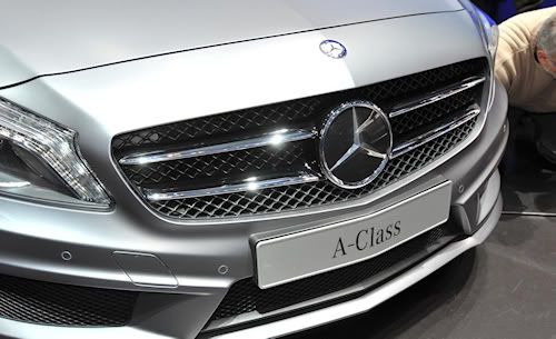
I totally agree. The gaudy "bling style" grille logo shown on the 2013 Mercedes A-Class below would be more fitting on a gold chain around a rapper's neck than at the front of a fine motorcar.
Figure 1. 2013 Mercedes A-Class grille
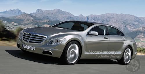
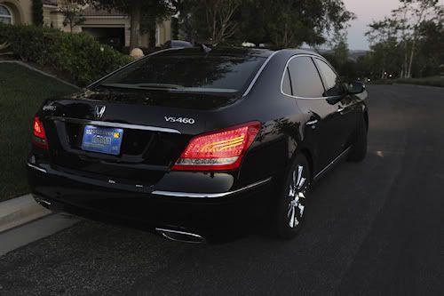
I have to wonder though, if the Mercedes' basketball sized grille logos are an overreaction to the thirsty far-east auto manufacturers who have been shamelessly biting Mercedes' style. Compare the pictures of the Hyundai Equus and Mercedes S-Class below:
Figure 2. Mercedes S-Class front.
Figure 3. Hyundai Equus front.
Figure 4. Mercedes S-Class rear.
Figure 5. Hyundai Equus rear.
See how they do?
There used to be a time when a Benz was visually distinguishable, from any viewing angle, from any other car on the road. Today, that is not the case. I imagine that people who drop the cash for a Benz S-Class are none too pleased that their luxury motorcar might be mistaken for a Hyundai. Even close-up, the Hyundai Equus could be mistaken for a Mercedes S-Class by a casual, uninformed observer. The basketball sized grille logo helps to assure that such misunderstandings do not occur.Proud and loyal citizen of the Digital Domain and Solid State Country! -

Figure 4. Mercedes S-Class rear.
Love the stance of this Benz ..
Could be but look in the first photo not only do they have the big logo but a small one right above it.. OVERKILL!! -
Could be but look in the first photo not only do they have the big logo but a small one right above it.. OVERKILL!!
That's not overkill, that's being paranoid about your brand recognition!:cheesygrin:Proud and loyal citizen of the Digital Domain and Solid State Country! -
I believe, according to Polk legend, the original heart was done by George Klopfer on a dinner napkin. Maybe KAB can remember the story?
-
-
Thanks Kenneth,I think I read up on that somewhere I just can not remember?I know I read about how the story came about of Matthew Polks love for great sounding music in speaker building and something about how the "heart" emblem representes that.:question:Kenneth Swauger wrote: »I believe, according to Polk legend, the original heart was done by George Klopfer on a dinner napkin. Maybe KAB can remember the story? -
I'm bowing out of this discussion. I like it the site aspects and I think it's rude to keep all this discussion going. My ol' lady can sign up and post her own thoughts next time.
-
It's not as if Polk is going to change their logo based on what is said by a bunch of armchair experts.
RT-12, CS350-LS, PSW-300, Infinity Overture 1, Monoprice RC-65i
Adcom GFA-545II, GFA-6000, Outlaw Audio 990, Netgear NeoTV
Denon DCM-460, DMD-1000, Sony BDP-360, Bravia KDL-40Z4100/S
Monster AVL-300, HTS-2500 MKII -
It's not as if Polk is going to change their logo based on what is said by a bunch of armchair experts.
Exactly.
I think the feedback went too far. But what do I know?


