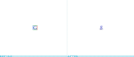
Stupid New Google "g"

zingo
Posts: 11,258
I am just complaining about the new, lower case "g" that Google uses as its icon. When it was first changed, I had no idea what it was and it threw me off. Now that I know, I just don't like it...

Post edited by zingo on
Comments
-
I actually prefer it. Old one was cool, but now it looks antiquated, being so plain and large, etc.
In UseGeorge Grand wrote: »
PS3, Yamaha CDR-HD1300, Plex, Amazon Fire TV Gen 2
Pioneer Elite VSX-52, Parasound HCA-1000A
Klipsch RF-82ii, RC-62ii, RS-42ii, RW-10d
Epson 8700UB
In Storage
[Home Audio]
Rotel RCD-02, Yamaha KX-W900U, Sony ST-S500ES, Denon DP-7F
Pro-Ject Phono Box MKII, Parasound P/HP-850, ASL Wave 20 monoblocks
Klipsch RF-35, RB-51ii
[Car Audio]
Pioneer Premier DEH-P860MP, Memphis 16-MCA3004, Boston Acoustic RC520 -
I got the old one, I want to new one.
Speakers
Carver Amazing Fronts
CS400i Center
RT800i's Rears
Sub Paradigm Servo 15
Electronics
Conrad Johnson PV-5 pre-amp
Parasound Halo A23
Pioneer 84TXSi AVR
Pioneer 79Avi DVD
Sony CX400 CD changer
Panasonic 42-PX60U Plasma
WMC Win7 32bit HD DVR -
You can have my new one, I don't like it either.
-
+1. Don't like it eitherI refuse to argue with idiots, because people can't tell the DIFFERENCE!
-
Ok seen it now and I can say no I don't like it either but I seen it with the g thing with some greyness on the outside edge of icon. I also use Google search which has the old style icon shown all the time on IE window.
Speakers
Carver Amazing Fronts
CS400i Center
RT800i's Rears
Sub Paradigm Servo 15
Electronics
Conrad Johnson PV-5 pre-amp
Parasound Halo A23
Pioneer 84TXSi AVR
Pioneer 79Avi DVD
Sony CX400 CD changer
Panasonic 42-PX60U Plasma
WMC Win7 32bit HD DVR -
Also not a big fan. Glad I'm not the only one who notices.If you will it, dude, it is no dream.
-
As long as it works I really don't care.Michael

In the beginning, all knowledge was new!
NORTH of 60° -
change for the sake of change.
-
I think my issue with it is it doesn't look very strong. It's just some limp little letter that doesn't command. Beef up Google!
-
I have to go with the new one.
The old one looks like a font you'd see at the Library of Congress; the new one looks like a snake, ready for action, font-wise.Sal Palooza


